
I took IELTS Academic in July 2014 and IELTS UKVI Academic in February 2016. I took both of these tests through Australian Education Office. I scored 8.0 overall both of these times. I scored 7.5 in writing in my first attempt and 7.0 in writing in my second attempt.
I took roughly 8 weeks to prepare for IELTS both the times, out of which 6 to 7 weeks were spent on writing.
I have been asked by a lot of people to share my IELTS task 1 and task 2 writings. In this post, I have shared some of my task 1 writings.
The writings that I have shared in this post were some of my better attempts, which I wrote just a few days before I took the test.
List of Task 1 Writings in this Post:
01. Book 3, Test 2.
02. Book 3, Test 3.
03. Book 4, Test 1.
04. Book 4, Test 2.
05. Book 4, Test 3.
06. Book 4, Test 4.
07. Book 5, Test 1.
08. Book 5, Test 2.
09. Book 5, Test 3.
10. Book 5, Test 4.
11. Book 6, Test 1.
12. Book 6, Test 2.
13. Book 6, Test 3.
14. Book 6, Test 4.
15. Book 7, Test 1.
16. Book 7, Test 2.
17. Book 7, Test 3.
18. Book 7, Test 4.
19. Book 9, Test 3.
01. Book 3, Test 2
The chart below shows the amount spent on six consumer goods in four Europen countries.
Write a report for a university lecturer describing the information shown below.


02. Book 3, Test 3
The charts below show the levels of participation in education and science in developing and industrialized countries in 1980 and 1990.
Write a report for a university lecturer describing information shown below.


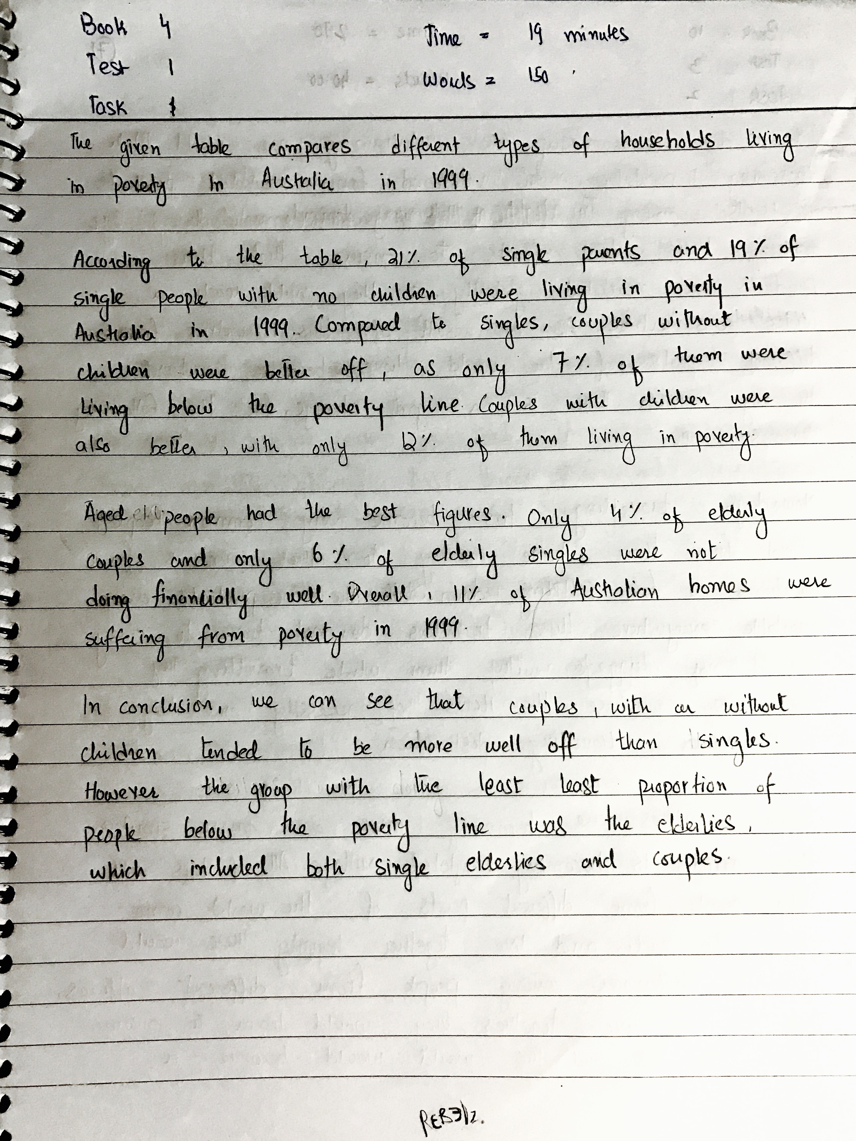
03. Book 4, Test 1
The table below shows the proportion of different categories of families living in poverty in Australia in 1999.
Summarize the information by selecting and reporting the main features, and make comparisons where relevant.
04. Book 4, Test 2
The graph below shows the demand for electricity in England during typical days in winter and summer. The pie chart shows how electricity is used in an average English home.
Summarize the information by selecting and reporting the main features, and make comparisons where relevant.

05. Book 4, Test 3
The chart below shows the different levels of post-school qualifications in Australia and the proportion of men and women who held them in 1999.
Summarize the information by selecting and reporting the main features and make comparisons where relevant.

06. Book 4, Test 4
The charts below give information about travel to and from the UK, and about the most popular countries for UK residents to visit.
Summarize the information by selecting and reporting the main features, and make comparisons where relevant.

07. Book 5, Test 1
The graph below shows the proportion of population ages 65 and over between 1940 and 2040 in three different countries.
Summarize the information by selecting and reporting the main features, and make comparisons where relevant.

08. Book 5, Test 2
The charts below show the main reasons for study among students of different age groups and the amount of support they received from employers.
Summarize the information by selecting and reporting the main features, and make comparisons where relevant.

09. Book 5, Test 3
The map below is of the town of Garlsdon. A new supermarket (S) is planned for the town. The map shows two possible sites for the supermarket.
Summarize the information by selecting and reporting the main features, and make comparisons where relevant.

10. Book 5, Test 4
The table below gives information about the underground railway systems in six cities.
Summarize the information by selecting and reporting the main features, and make comparisons where relevant.

11. Book 6, Test 1
The graph and table below give information about water use worldwide and water consumption in two different countries.
Summarize the information by selecting and reporting the main features, and make comparisons where relevant.

12. Book 6, Test 2
The graph and table below give information about changes in modes of travel in England between 1985 and 2000.
Summarize the information by selecting and reporting the main features, and make comparisons where relevant.

13. Book 6, Test 3
The diagrams below show the life cycle of a silkworm and the stages in the production of silk cloth.
Summarize the information by selecting and reporting the main features, and make comparisons where relevant.

14. Book 6, Test 4
The charts below give information about USA marriage and divorce rates between 1970 and 2000, and the marital status of adult Americans in two of the years.
Summarize the information by selecting and reporting the main features, and make comparisons where relevant.

15. Book 7, Test 1
The table below gives information on consumer spending on different items in five different countries in 2002.
Summarize the information by selecting and reporting the main features, and make comparisons where relevant.

16. Book 7, Test 2
The graph below shows the consumption of fish and some different kinds of meat in a European country between 1979 and 2004.
Summarize the information by selecting and reporting the main features, and make comparisons where relevant.

17. Book 7, Test 3
The chart below shows information about changes in average house prices in five different cities between 1990 and 2002 compared with the average house prices in 1989.
Summarize the information by selecting and reporting the main features, and make comparisons where relevant.

18. Book 7, Test 4
The pie charts below show units of electricity production by fuel sources in Australia and France in 1980 and 2000.
Summarize the information by selecting and reporting the main features, and make comparisons where relevant.

19. Book 9, Test 3
The two maps below show an island before and after the construction of some tourist facilities.
Summarize the information by selecting and reporting the main features, and make comparisons where relevant.

Wow
Thank you! 😊
It’s great help. Thanks a lot
Thank you for your kind words! And thank you for visiting the blog! 🙂
Thank you Naseer for share your experience !!! It is to me very useful !!! Fabiana, from Argentina
Thank you for your kind words! And thank you for visiting the blog! I’m glad it helped. 😊
It’s very informative, but plz help in Reading part.
This might help:
https://naseersjourney.com/2017/02/09/studying-for-ielts/